A mainly tech blog that sometimes touches politics and education. I use a Mac so you will hear about that and I live in Minneapolis, Minnesota USA so you will hear about our upcoming municipal Wi-Fi mesh network. I believe that open source is the only way to build big software so that may come up too. Est. 2004.
pfhyper[at]gmail.com
must remove NOSPAM before emailing!
PF Hyper Home
Bio & Resume
Profile
PF Hyper's Photos
Recent
This blog has moved
FRESH events
bad news / good news when court says FCC can't req...
Is Yelp filtering reviews for a fee?
Success: Seward Profile is sourced!
"Borrowing" content from Seward Profile
Pioneer Press writer Kathie Jenkins forgets to lin...
Minneapolis Digital Inclusion Fund Advisory Commit...
Viacom vs. YouTube
Posterous adds "page breaks" + timed releases
Archives
02/01/2004 - 03/01/2004
05/01/2004 - 06/01/2004
09/01/2004 - 10/01/2004
10/01/2004 - 11/01/2004
11/01/2004 - 12/01/2004
12/01/2004 - 01/01/2005
01/01/2005 - 02/01/2005
02/01/2005 - 03/01/2005
03/01/2005 - 04/01/2005
04/01/2005 - 05/01/2005
05/01/2005 - 06/01/2005
06/01/2005 - 07/01/2005
07/01/2005 - 08/01/2005
08/01/2005 - 09/01/2005
09/01/2005 - 10/01/2005
10/01/2005 - 11/01/2005
11/01/2005 - 12/01/2005
12/01/2005 - 01/01/2006
01/01/2006 - 02/01/2006
02/01/2006 - 03/01/2006
03/01/2006 - 04/01/2006
04/01/2006 - 05/01/2006
05/01/2006 - 06/01/2006
06/01/2006 - 07/01/2006
07/01/2006 - 08/01/2006
08/01/2006 - 09/01/2006
09/01/2006 - 10/01/2006
10/01/2006 - 11/01/2006
11/01/2006 - 12/01/2006
12/01/2006 - 01/01/2007
01/01/2007 - 02/01/2007
02/01/2007 - 03/01/2007
03/01/2007 - 04/01/2007
04/01/2007 - 05/01/2007
05/01/2007 - 06/01/2007
06/01/2007 - 07/01/2007
07/01/2007 - 08/01/2007
08/01/2007 - 09/01/2007
09/01/2007 - 10/01/2007
10/01/2007 - 11/01/2007
11/01/2007 - 12/01/2007
12/01/2007 - 01/01/2008
01/01/2008 - 02/01/2008
02/01/2008 - 03/01/2008
03/01/2008 - 04/01/2008
05/01/2008 - 06/01/2008
06/01/2008 - 07/01/2008
07/01/2008 - 08/01/2008
08/01/2008 - 09/01/2008
10/01/2008 - 11/01/2008
11/01/2008 - 12/01/2008
12/01/2008 - 01/01/2009
01/01/2009 - 02/01/2009
02/01/2009 - 03/01/2009
03/01/2009 - 04/01/2009
05/01/2009 - 06/01/2009
07/01/2009 - 08/01/2009
08/01/2009 - 09/01/2009
09/01/2009 - 10/01/2009
10/01/2009 - 11/01/2009
11/01/2009 - 12/01/2009
12/01/2009 - 01/01/2010
01/01/2010 - 02/01/2010
02/01/2010 - 03/01/2010
03/01/2010 - 04/01/2010
04/01/2010 - 05/01/2010
Blogarama
Blog Directory

This work is licensed under a Creative Commons License.
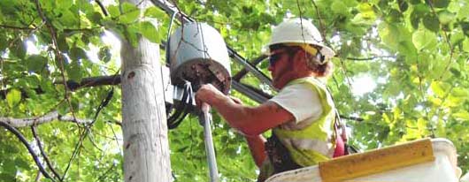
Worker adjusting the wireless access point outside my window.
Featured Tag: Wireless
Main Tags
art
blogging
learning
mac
movies
other
politics
science
tech
wireless
Wednesday, May 05, 2004
Powerpoint Thoughts
"Rather than learning to write a report using sentences, children are being taught how to formulate client pitches and infomercials." (Edward Tufte, "Powerpoint is Evil")
I'm with Edward and do see a danger of classroom use of Powerpoint, especially in the early grades. Writing (hopefully in sentences) needs to be promoted and Powerpoint is a way to short circuit that process. I would not want to see teachers asking for reports in a Powerpoint format only.
Powerpoint could be used for storyboarding and creating short illustrated stories. This would be an excellent use in lower grades. The software has a great set of drawing and painting tools.
I felt some of my ambivalence toward the software when creating my presentation for class. How much detail do I need to provide? Isn't this - a Powerpoint slide file - supposed to be an aid to a presentation and not a piece in itself? Can I really write something in bullet points?
The rubrics for the assignment did not help much. Evaluation points are listed for "2-3 different styles of graphics" and "2-3 different styles of text." Graphics should be used to enhance the message and I decided my presentation was content-based, conveying information, and did not need any decoration since I could not think of any graphics that would actually enhance the information for the reader.
This is a problem. Creating a rubric that calls for several graphics and several text styles implies creating content for a design rather than designing for the content. But I think this is a common way to approach Powerpoint and I think many budding Powerpoint designers want to use the neat features and shoehorn their content in among the decorative graphics, garish text styles and supercharged transitions and builds.
Text styles can be dangerous and use of several can easily make a presentation (Powerpoint-based or printed) look messy and confusing. Designers recommend that if you don't have experience working with text styles and fonts, it's best to simplify, even sticking to one choice.
But herein lies a major problem with Powerpoint. It's too easy to add the images, change the fonts, and choose from a stable of ill- conceived design templates. Even if you have nothing to say, you can dress it up, hoping that nobody will notice that the meat is sparse or missing altogether.
If anything can make a bad lecture or presentation worse, it's Powerpoint. Yet it can be a helpful tool in the right hands. But it often seems those hands are few and far between.
I like to use it as a brainstorming tool. I can write out my thoughts, order them in various ways and slowly organize my lecture. I will then use the slides in the lecture and hand out copies for notes. But most of my content will not be on the slides. It will be in my brain and the slides will be a subtle guide to push me along the right track. I tend to get sidetracked so the slides can help me stay focused.
Who is Edward Tufte?
Edward Tufte wrote "The Visual Display of Quantitative Information," a classic work on making charts and graphs that truly impart knowledge in an interesting manner. He's also an artist.
